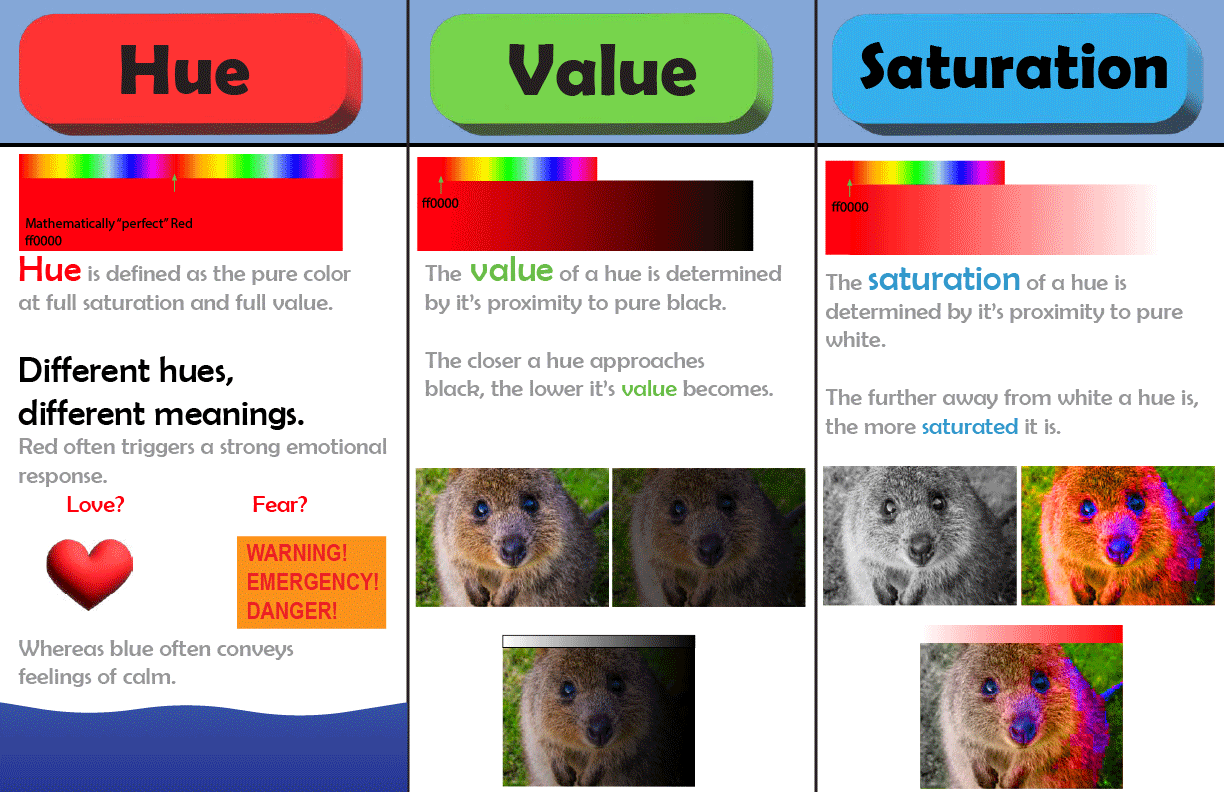

Reflection: I decided to create more visual consistency across all three sections of the page. That way it doesn’t look so lopsided and there are less words that you have to read. I created consistent size and distance of the elements across the whole infographic creating visual harmony. The Images are evenly spaced from eachother and as well as from the section dividers. Every section has a color-map and a gradient pertinent to its teaching. Every section has two sections of text giving a brief description of the section. Every section has 3 images that concisely demonstrate the principle.
© Giovanni Encarnacion